It’s Wednesday my dudes!
I was working on the slides for two of my talks and realized how minimal they were.
I had made it a habit to make my slides into tools that just assists my presentation and not something that is overloaded with information.
This has proven to be much effective.
Human beings are bad at multitasking. You cannot focus your attention on two things—listening to the person talking and trying to read their slides.
I use the default dark theme from Google Slides. Nothing fancy. Use 2-3 colors in the text and add graphics only where it is necessary.
I also limit each slide to one point and try to make this point stand out from the other text.
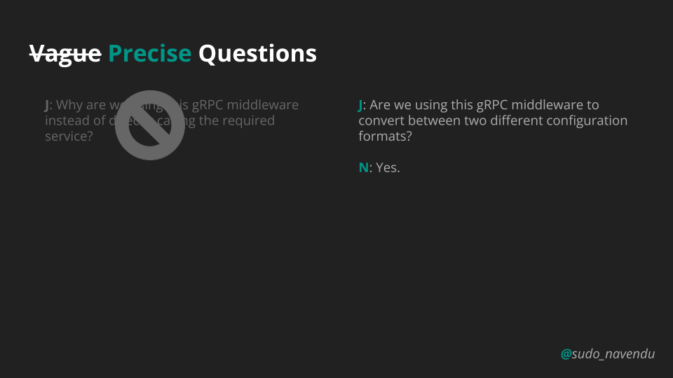
Example slide from an upcoming talk
Making your slides stand-alone works very well for certain situations like a reference material for a college course. Here the slides are not just tools to assist the presenter but resources for the viewer after the presentation.